Learning Journal

my chinese name

Game Design Research

Date: 27 February 2025

According to the article, Game Design Principles, the top 7 Important Game Design Principles are:

  • 1. Set Clear Goals and Objectives
  • 2. Engaging Core Mechanics
  • 3. Maintain Game Flow and Player Experience
  • 4. Balancing the Game
  • 5. Offer Feedback and Rewards
  • 6. Playtesting
  • 7. Sound Design

I think this article was pretty interesting to read. It gave me some insight on how important it is to focus on the user experience within a game. For instance, for number 2 of the principles, it defines what a user can or cannot do within a game. This is an important aspect for games because it places limitations on the user. If there were no limitations for a user, then the user may be too overwhelmed and exit the game. Another principle that stood out to me is number 6 of the principles, where it is important to playtest a game. Playtesting a game can help the developers and creators find out if the initial concept is fun and find issues within each stage of the game.

Visual Thinking Analysis

Date: 11 February 2025

brian's photo
Brian Rodriguez-Torres, 2025

The photo Brian exchanged with me is a photo he took in Sacramento, near the capital. He told me it is from a newer building that was recently constructed. I think the most interesting aspect of this image is the colors and the various line thicknesses. The photo's saturation appears to be very vibrant which highlights the blue while the lines are contrasting with their darker color.

The most obvious aspect that sticks out to me for this image is that the image is very geometric. However, this image has a lot of mystery to it too. It is hard to know what the image is about without some background information because the image can be a multitude of different things. I think in order to push visual thinking for this image would be adding a possible overlay of the building's floor plan or maybe additional lines that are inspired by something. I think this would give a more visual narrative to the image.

cuijian album
Cui Jian (崔健), 1989

I decided to change my images as I continue developing my narrative for the Every Picture project, but I am most excited about this album cover art with the main focus on the song "Nothing to My Name (一无所有)". One thing that you would not know from looking at this photo is the big impact it had for the youth who protested at the 1989 Tianmian Square protests.

This image relates to my topic as it was a song that was part of my early childhood which deeply influenced my music taste as an adult. Additionally, I would update the image to include the song name and artist so it is emphasized more.

Visual Thinking Strategies

Date: 06 February 2025

I thought it was fun seeing the images shown in the article, 10 Intriguing Photographs to Teach Close Reading and Visual Thinking Skills. It highlights how important it is to critically think about images through visual practices such as: noticing the details or asking open-ended questions about what is happening in the image.

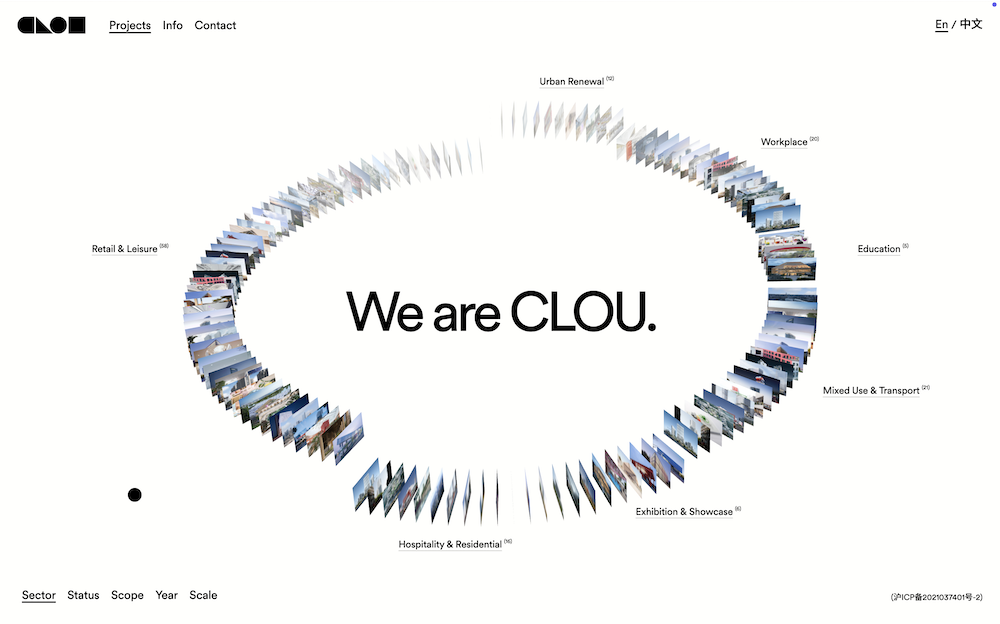
clou architects home

One of my favorite design firms, Clou Architects, is an excellent example of using photos and visual interactions to inspire visual thinking. On their home page, they display all their projects/works and the user has to scroll through them to view the names of said projects/works. Once a user clicks on a project, they can see images that relate to the project and how it was developed.

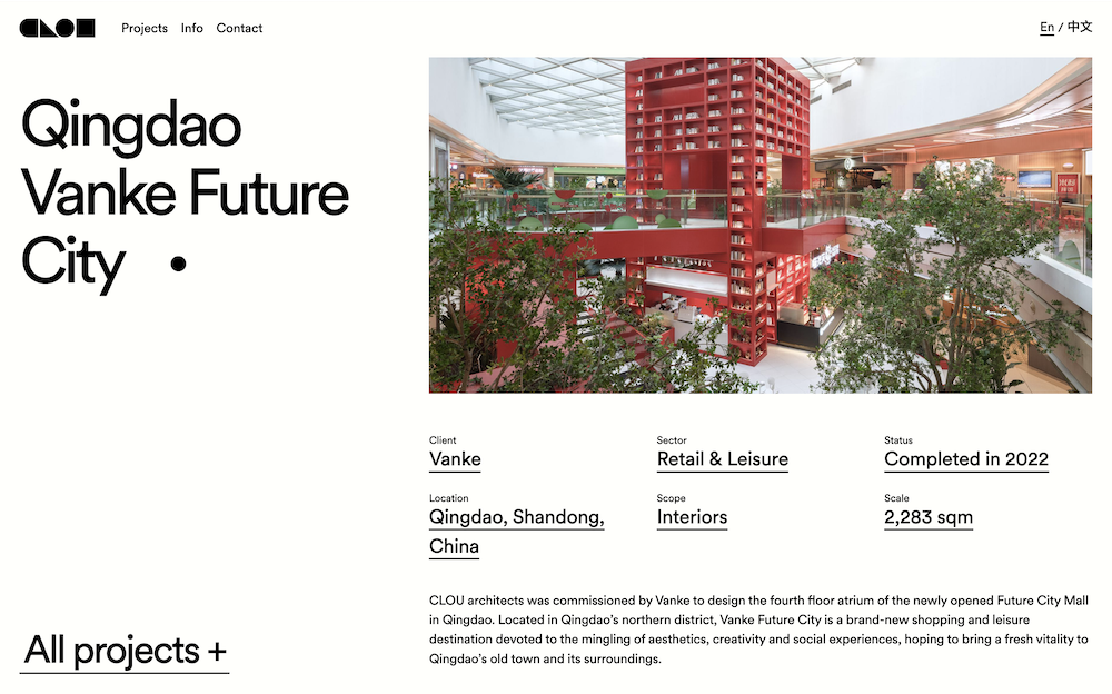
clou architects qingdao project

The images included on the Qingdao Vanke Future City project page, aid in the visually storytelling of the project and brand identity associated with it. The images focuses on the visual aspects of the project and areas the architecture firm wanted to highlight for user experience.

Overlays Design Pattern

Date: 28 January 2025

I found the article, Overuse of Overlays: How to Avoid Misusing Lightboxes, to be pretty informative. The article states how overlays and lightboxes are used purely for the designers convenience in order to avoid making a new page. It mentions how important it is to make overlays and lightboxes accessible to keyboard users by using the key to close it. It emphasizes when a designer is making an overlay, consider: who, what, when, where, and why?

Who is the target audience? What action is the user suppose to take? When will the overlay appear? Where will the overlay appear? Why does it need to be an overlay? I think these questions are really beneficial for designers to consider when they decide to create an overlay as it focuses on accessibility and making informed design decisions.

I think it is very important to make sure to plan when to use an overlay and consider when it is better to make a new page. Additionally, the article states how important it is to make overlays accessible whether it is optimizing it for different devices or making it compatible with keyboard users.

Form Design Research

Date: 17 January 2025

I thought the article, Best Practices for Form Design, was a very insightful read. I learned more about better ways to design forms to increase user usage and better user experience. For instance, one thing that stood out to me was the inline labels and that it is best to not have the labels inside the input field but on top of them. This also applies to placeholder text which was really interesting to learn as I noticed for forms I have filled out before they tend to follow these practices. Another aspect which I thought was very important was the tab ready section. It highlights the importance of accessibility and making the form inputs easy to navigate which is good for accessibility.

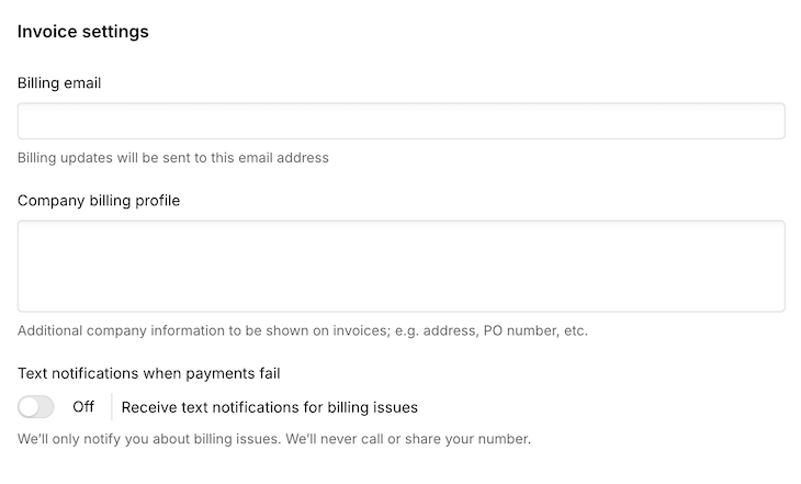
screenshot of webflow invoice form

An example website that I think explimifies these practices is Webflow, more specifically their invoice section under the billing section for one's website. For instance, the form displays labels above the input field with addition to providing support text next to those input fields to give users information on why Webflow needs/uses the information. I can specifically see this with the "Text notifications when payments fail" part as the support text reassures the user that Webflow will not share the user's phone number and only use their number for payment fail notifications.